Principles of Web Design
I write books that help make digital design clearer and more accessible.
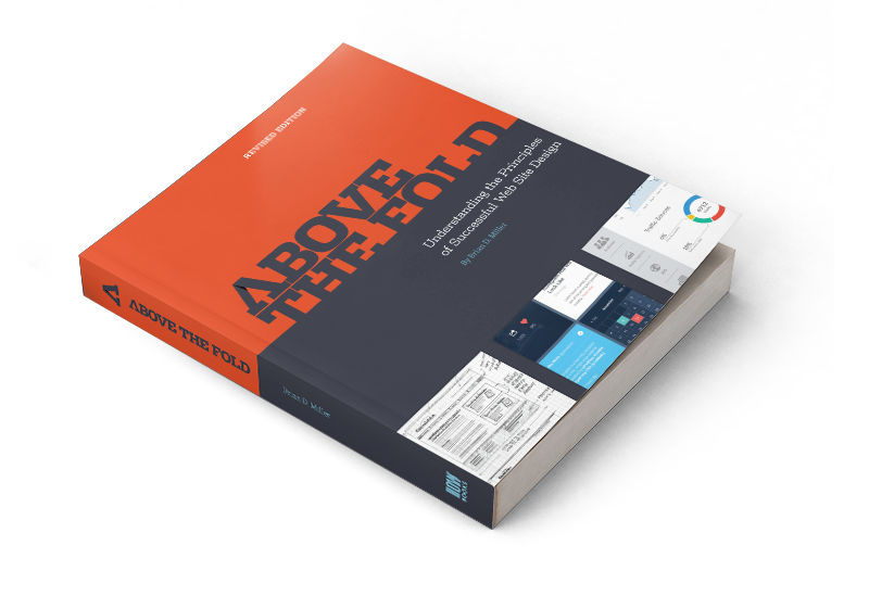
Above the Fold, now in its second edition from Simon & Schuster, and Principles of Web Design, are written for students, educators, and professionals who want to understand the fundamentals of graphic communication in a screen-based world. Both books are used as textbooks in design programs across the country, and Above the Fold reached #1 on Amazon’s Web Design bestseller list.
These books are grounded in real-world practice but written to be approachable and practical—designed to help readers build confidence, sharpen their skills, and create work that connects.

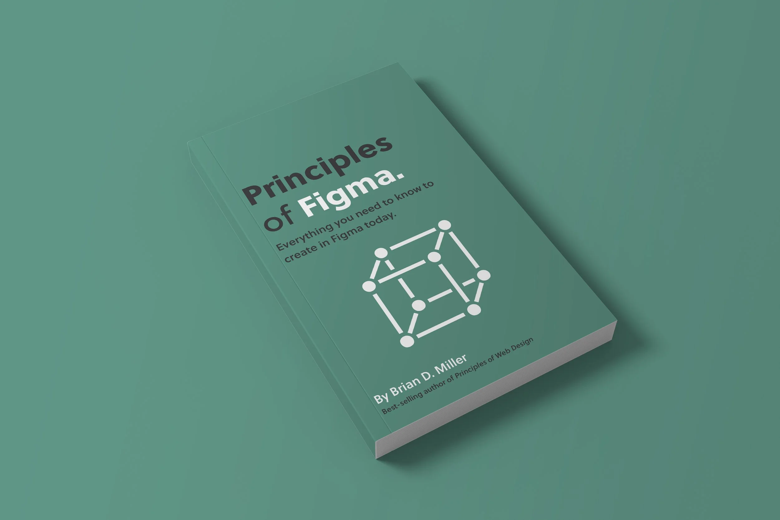
Principles of… Book Series
Based on my best-selling book Principles of Web Design, the Principles of… series dives deeper into the concepts every designer should know beyond the canvas. Each book focuses on the practical skills that surround design—tools, platforms, business practices, and strategies that help creative professionals thrive. From mastering Shopify and Klaviyo to understanding Amazon, CRM, and beyond, these guides give designers the knowledge to grow their craft, manage their careers, and succeed in the ever-expanding world of digital design. Coming soon!


Earlier Editions — Above the Fold
The first and second editions of Above the Fold reached #1 on Amazon’s Web Design book list and have been used in classrooms across the country to teach the fundamentals of digital design. These earlier editions laid the groundwork for what would become the fully updated and reimagined Principles of Web Design. Drawing from years of industry evolution and feedback from educators and professionals, Principles of Web Design expands on the original material with a deeper focus on user experience, accessibility, and responsive design. Built on a strong legacy, this latest edition continues to serve as a trusted resource for students, educators, and design teams alike.

Select Reviews
Published Works
Through my long-standing relationship with HOW Design, I’ve had the opportunity to publish a number of articles on branding, UX, and creative strategy. Below are two examples of the work I’ve contributed.
Excerpt from What a Soda Machine Can Tell Us About Information Architecture
Featured in the August 2012 issue of HOW Magazine.
Although I spend most of my time working out of my home studio, I recently consulted on-site at a large NYC interactive agency. At this agency, like most office environments, they had two soda machines from two popular soda companies. With the agency subsidy, a can of soda was only 25¢ and I was repeat customer.
Most days I stuck with my favorite soda, putting in a dollar, hitting the button, waiting, reaching down to get my soda, then off to the right was my change. Simple. Then one day this machine (call it machine A) ran out — due in large part to my insatiable appetite for diet soda — forcing me to use the other brand’s machine (call it machine B). So, I put in my dollar, pushed the button, waited, reached down for my soda and it was then I discovered something very cool; my change was right there next to the soda waiting for me. Not over to the right where it had been on machine A, but right there where it was convenient for me, next to my cold soda.
That’s information architecture.
Excerpt from Web Design Education: A Problem of Specialization
When I was a kid in the mid 1980s, my dad came home with a brand new appliance for our kitchen. It was a microwave and a toaster oven all wrapped up into one big, brown, metal package. My dad, an engineer with close to 1,000 patents on everything from robots to cordless tooth brushes, was a sucker for gadgets and this counterspace-saving miracle of technology was his latest find.
The problem with this toaster/microwave was it didn’t really toast things all that well and it didn’t microwave things either. It was caught in a nether-region of less-than usefulness under the guise of being extra useful.
This is the same area where you’ll find many Web design students these days — caught somewhere between learning code and learning how to effectively communicate a message through design, without really mastering either skill. There’s a problem with Web design education today and it has to do with specialization.

Other Writings: Type Directors Club
As an executive board member and competition chairperson of the Type Directors Club (TDC), I had the honor of organizing the 58th annual international typography competition—one of the most respected showcases of typographic excellence in the world. I was responsible for selecting the jury, led by legendary designer Paula Scher, and overseeing the judging process that would determine the year’s most outstanding typographic work. In addition to curating the panel, I was also tasked with writing the introduction to the competition annual—a publication widely regarded as a definitive catalog of the best typography being produced globally. It was both a humbling and inspiring experience to help shape a competition that continues to influence the design community around the world.
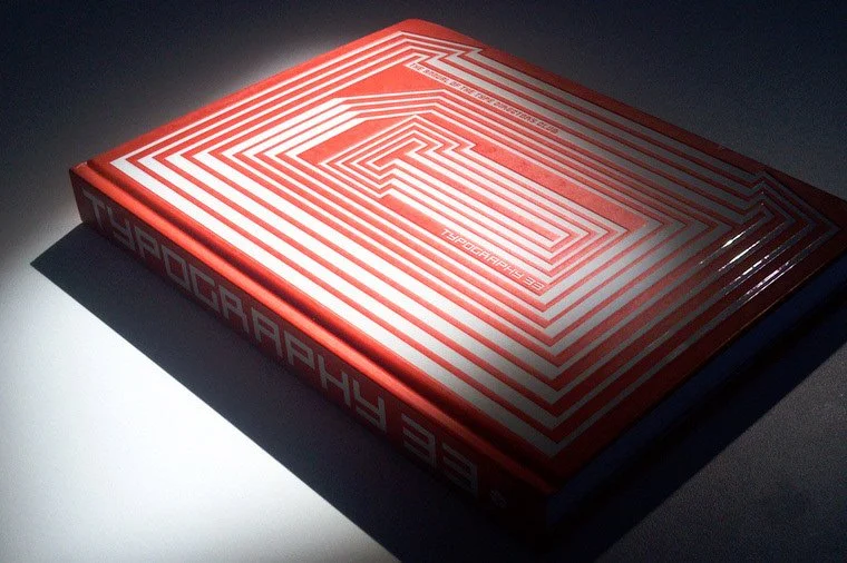
Introduction to Typography 35
Like so many designers and typographers, I discovered the Type Directors Club through this book. The work on these pages back then opened my eyes to a new world of possibilities with typography. Soon after seeing the book in the mid-1990s, I joined the TDC. I joined not for the perks and discounts or the mention on my resumé, but because the Club stood for something — and by joining, I became a part of it.
For sixty-five years, the Type Directors Club has represented something more than a book or a competition to its members. It is a constant. It’s an old friend. A mentor. It’s a beacon. It’s a community of like-minded designers carrying on the mission to promote excellence in typography. For those who value type, the TDC represents an indispensable resource, fostering and nurturing various forms of typographic exploration and preservation in any medium.
Today, being part of a real global community sharing a common mission is more important than ever. With so many outlets offering an artificial sense of community, it’s comforting to know that TDC provides its members with a true sense of belonging and purpose. Getting something out of a TDC membership means putting something in. The work I put in on the TDC board and as the web committee chairman over the past four years has paid immeasurable dividends, both professionally and personally. I’ve had the opportunity to meet and work with some of the most talented typographers in the world and form lasting friendships. But perhaps the biggest reward came when I was selected as the chairman of TDC58.
Having the privilege of being the competition chair person afforded me the honor of working with Paula Scher. Paula dedicated her valuable time and talent to develop a beautiful and extensible design system that spoke universally to our global audience—reinforcing the sense of welcoming and community that the TDC embodies. Thank you, Paula.
The weight of the responsibility that comes with carrying on this 58-year-old tradition by selecting a jury to judge the best typographic work in the world was not lost on me. For this task, I had one goal: capture the same diversity of talent that exists in the Club’s membership base and in the world of typography today. I’d like to thank each of the jurors who did just that. By sharing their energy and expertise they have selected work that will stand as a record of the typography of our time, and we hope this will move a new generation of artists to discover type and to get involved with something greater.
Congratulations to each of the winners whose work appears in this book. The fact that each year the work we receive gets more innovative, creative, and inspiring is proof that the TDC’s best days lie ahead.